




Twinfig blue
The accent. One primary action or highlight per view.
- HEX
- RGB
- HSL
- CMYK
- Pantone
- Token
Press kit
Every file here follows the same 48-unit grid as the mark. Download the whole kit, or take just what you need.
Logos
SVG for anything that scales, transparent PNG at 2048 px for everything else. The text is outlined, so no fonts are needed.
Usage
Two equal tiles, offset by a quarter of the mark. Where they overlap is the lens, whose curves share the grid’s centre. Every lockup rule comes from those numbers.
 Mark · 16px
 Horizontal · 20px mark
 Stacked · 48px mark
Twinfig, one word, capital T. Not TwinFig, Twin Fig or TWINFIG. Twinfig is not affiliated with Figma, so please don’t describe it as a Figma product.
Don’t rotate or skew it.
Don’t recolour the tiles or the gradient.
Don’t stretch or squash it.
Don’t add shadows, glows or outlines.
Don’t put the colour logo on busy or mid-tone colour. Use white.
Don’t set the name in live type next to the mark.
Colours
Click any value to copy it. CMYK is a straight conversion and Pantone is the nearest match, so proof both on press.
The accent. One primary action or highlight per view.
Dark surfaces, the top of the sky.
Text and the mono logo.
Page ground.
The lens on light. Tinted fills.
Gradient highlight.
Accent on dark.
Gradient shadow.
Accent text on light.
Selected and hover fills.
Back tile, top-left.
Back tile, bottom-right. Darkest surface.
Secondary text.
Labels and captions.
Card and window borders.
Dividers.
Behind product shots.
Cards, the mono logo on colour.
Gradients
The mark’s gradients share one direction, so separate shapes read as one lit object. Click a gradient to copy its CSS.
The front tile, buttons, the second tittle.
The overlap on light.
The back tile on light.
The back tile on dark.
The overlap on dark.
Blue surfaces and app icons.
Social and slide backgrounds.
The website hero: navy into blue into paper.
Type
Geist for everything you read, Geist Mono for labels, code and shortcuts. Both are free under the SIL Open Font License.
Aa
ABCDEFGHIJKLMNOPQRSTUVWXYZ abcdefghijklmnopqrstuvwxyz 0123456789 &→
Aa
ABCDEFGHIJKLM abcdefghijklm 0123456789 ⌥⇧⌘ { } < />
Any interface, editable.
Real text, exact auto layout.
Components and variables, built for you
Paste a URL or capture anything you can open in Chrome. Twinfig rebuilds it the way a designer would.
For designers who build in code
Auto layout · gap 16 · ⌥⇧P
Patterns
Five backgrounds made of dots, marks, lines and light, all on the same 12-unit grid and lit from the top left. Use them behind content, never behind the logo.
Product
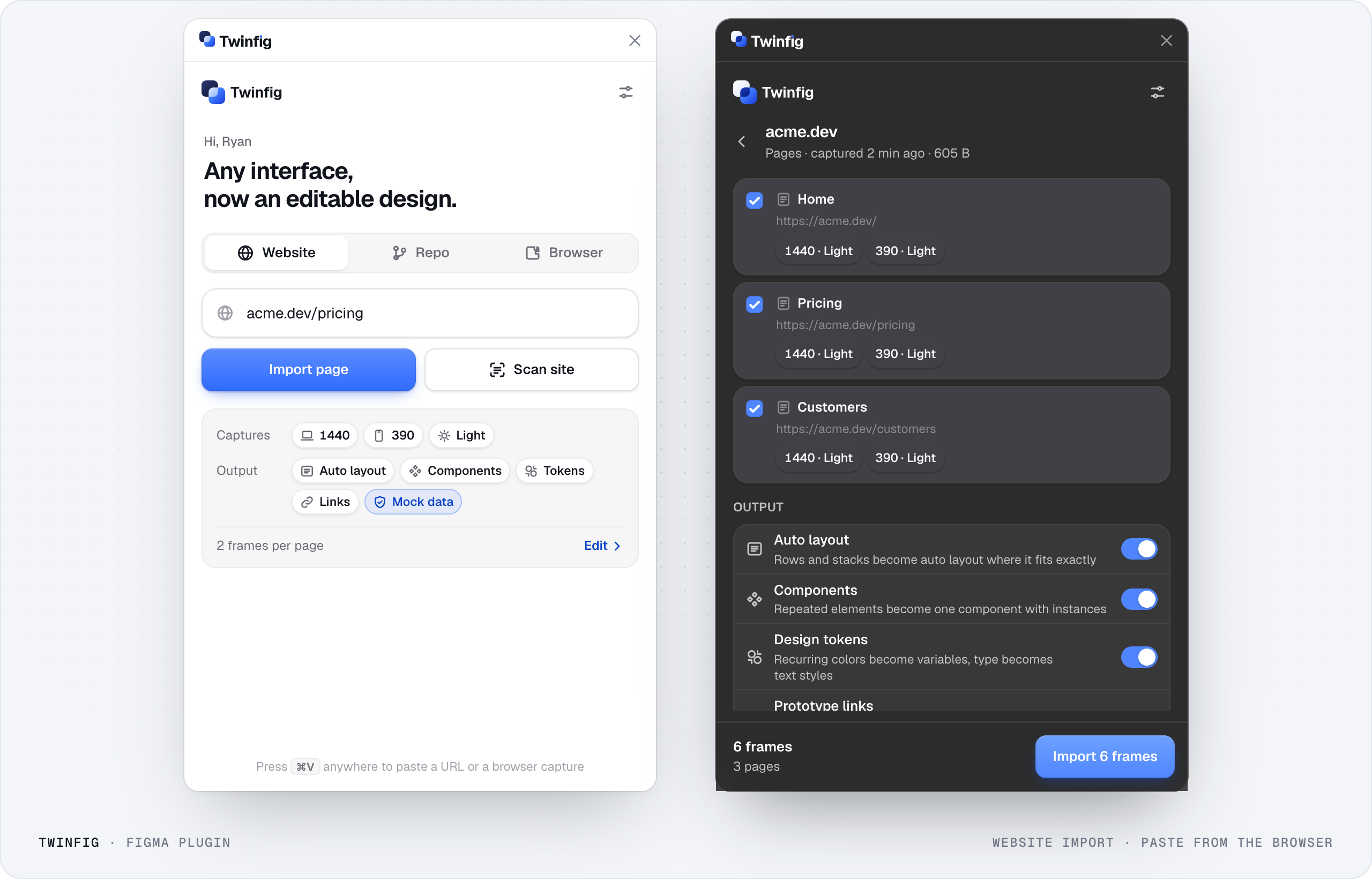
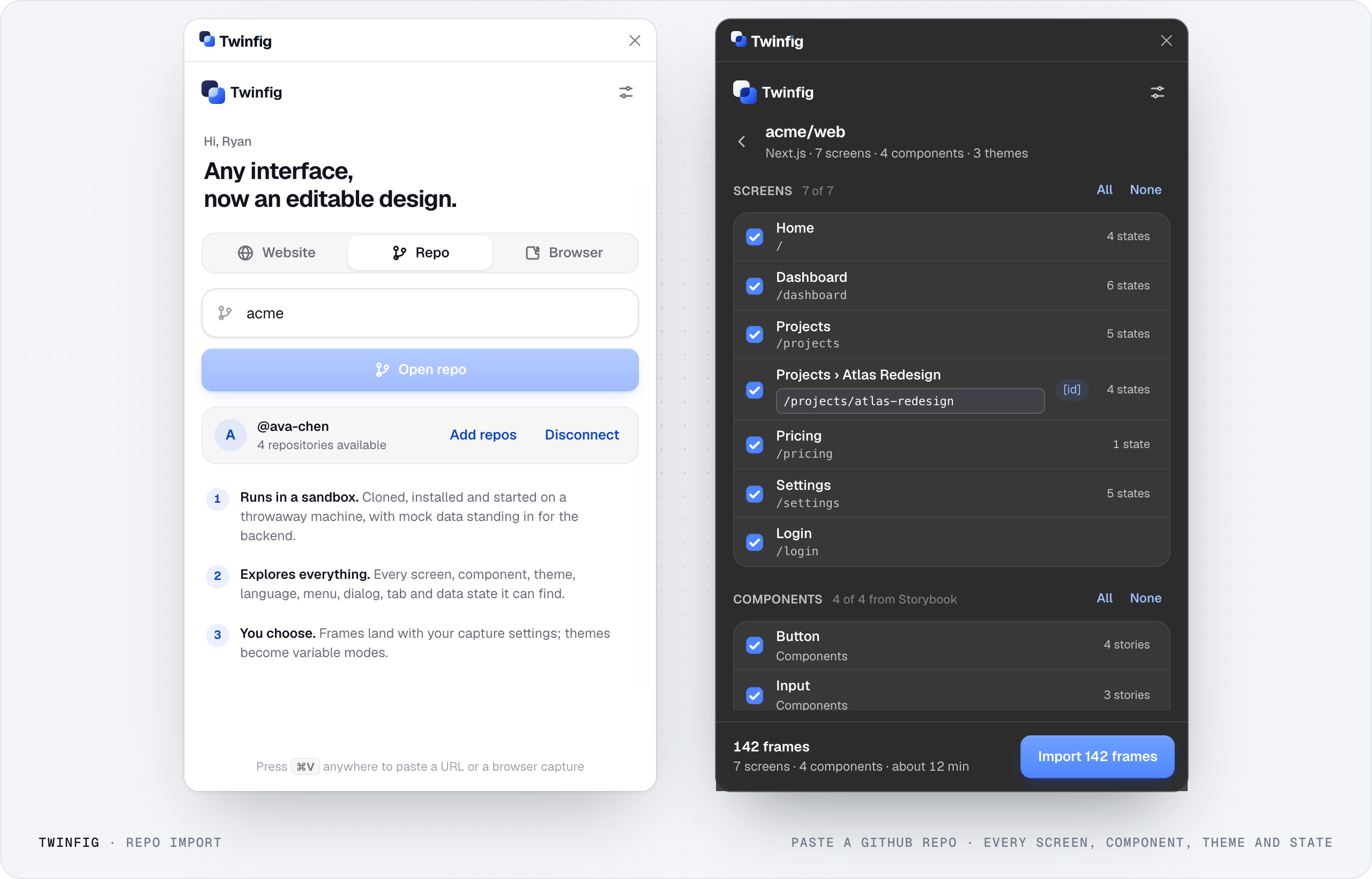
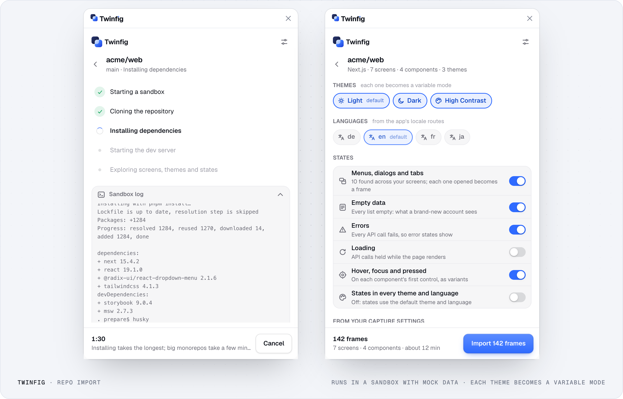
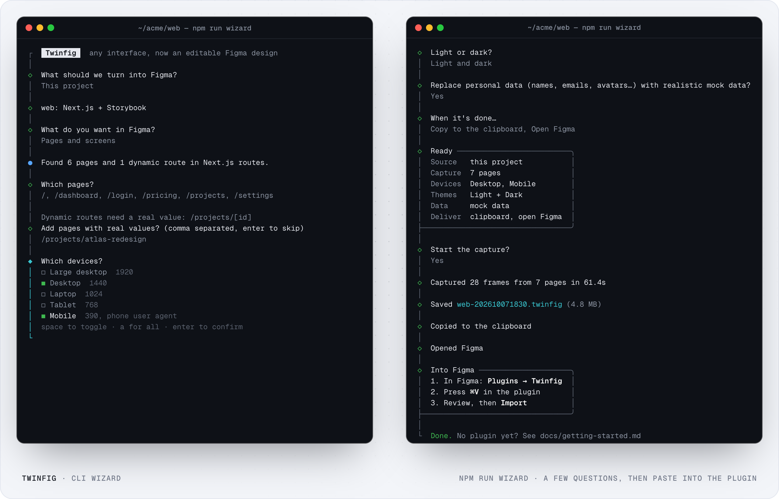
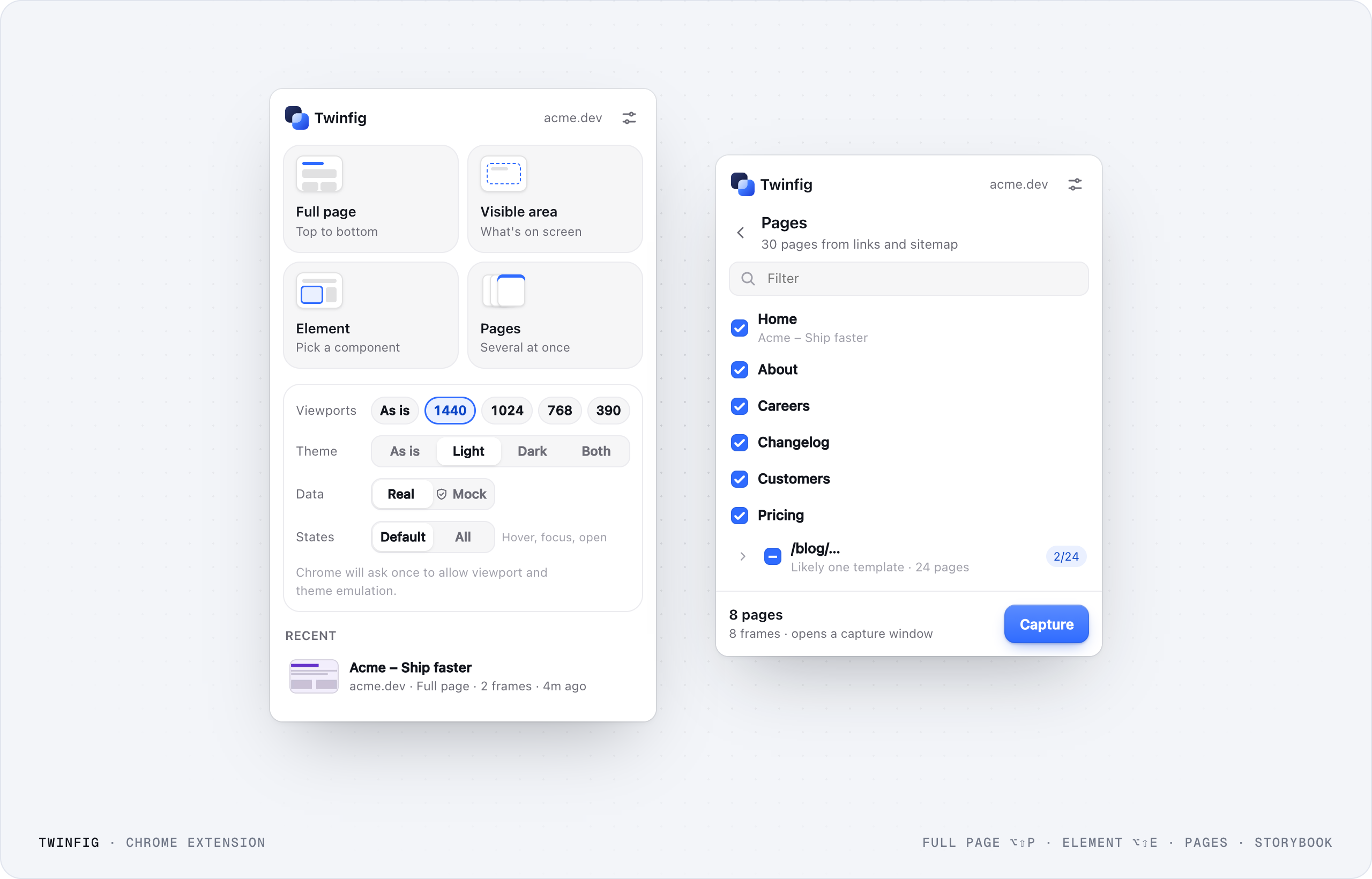
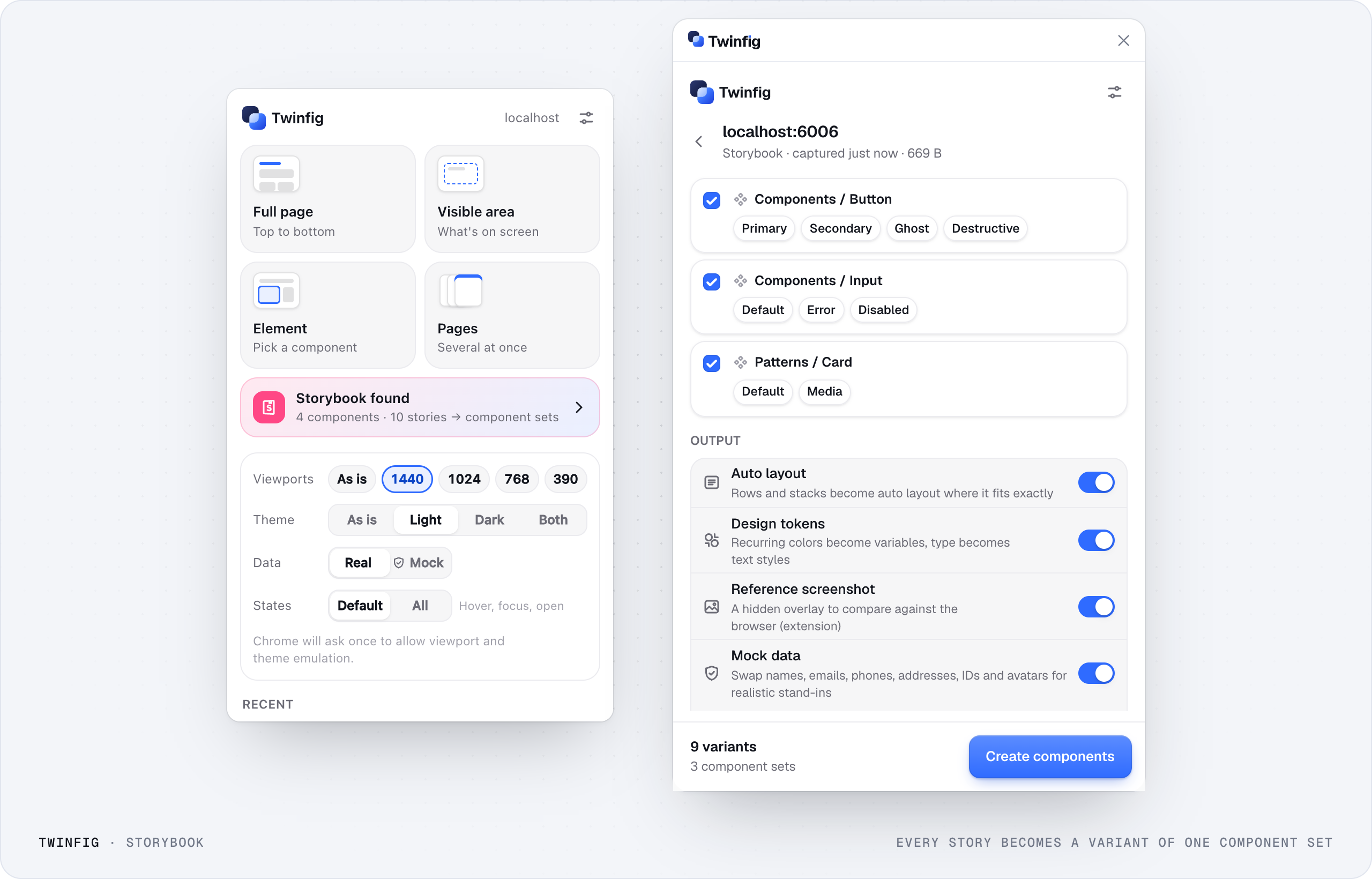
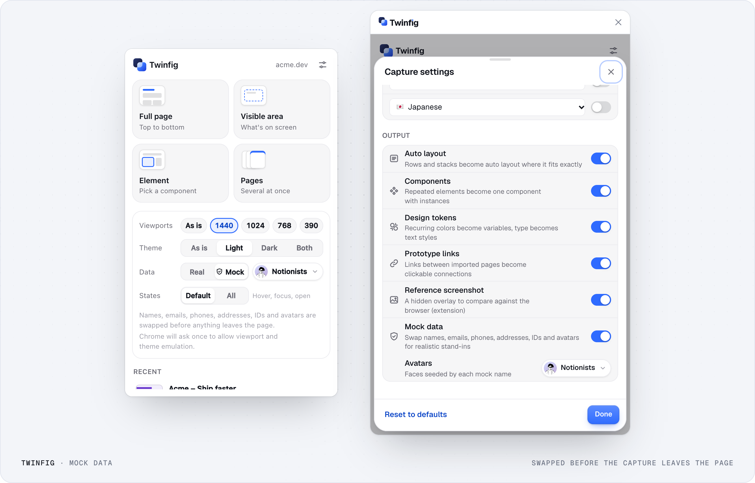
Product images at 2560 px wide. Crop them, but don’t edit what the product shows.
Copy
Plain and specific. Click a block to copy it.







Social templates
Five templates, every size.
Edit the text right here and download a PNG at the network’s native size. Your text carries over when you switch sizes.